UX Research on Nike.com: Improving User Experience and Solving UX Problems
In this case study, we'll delve into the UX research conducted on Nike.com to identify areas for improvement and propose effective solutions. By focusing on enhancing the website's user experience, we aimed to create a more seamless and engaging journey for Nike's customers.
Disorganized Header: A Cluttered Experience
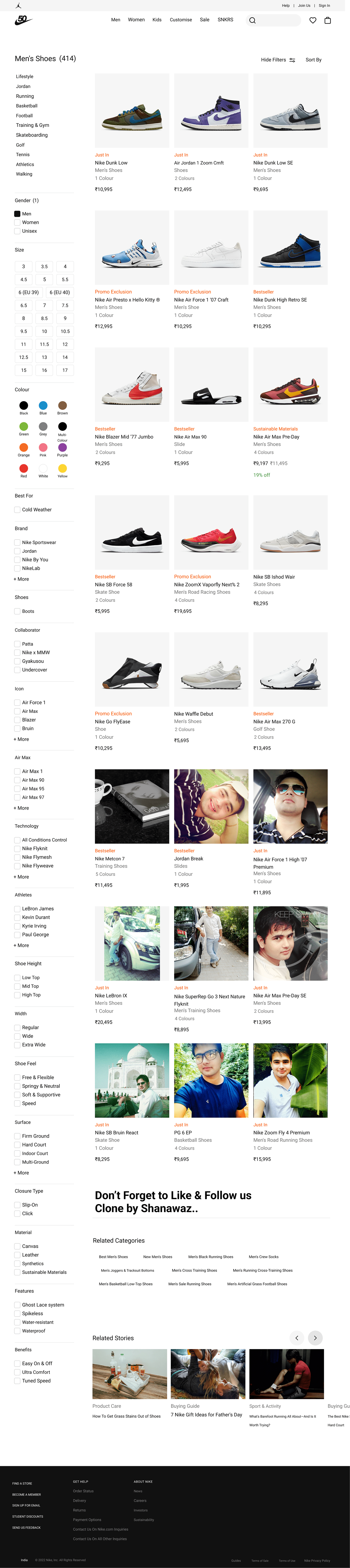
One of the key issues identified during the UX research was the disorganized header section on Nike's website. The varying sizes of the logos for Nike, Jordan, and Converse contributed to an inconsistent and cluttered design. This lack of uniformity may have resulted in a suboptimal user experience, potentially hindering users' ability to navigate between the different brands efficiently.
To address this problem, we implemented a solution that transformed the header section into a more organized and visually appealing element. We combined the logos of all three brands into a single logo, which we placed prominently in the website header. When users hover their mouse over the Nike logo, the logos of Nike, Jordan, and Converse appear simultaneously, allowing users to easily click and navigate to the specific brand they wish to explore.
Streamlining and Enhancing the User Experience
The proposed solution not only improved the overall user experience by simplifying brand navigation, but it also helped create a more cohesive and unified brand identity for Nike. By combining the logos into one, Nike showcases the strength of its brand portfolio while ensuring a streamlined user journey.
Additionally, we added an animation to the logo, aiming to captivate users' attention. When users interact with the Nike logo, the logos of all three brands animate, creating an element of intrigue and curiosity. This animation not only serves as a visual delight but also enhances the user experience by engaging users and encouraging them to explore the various brand offerings available on Nike.com.
Conclusion
Through careful UX research and analysis, we identified and addressed the disorganized header section on Nike.com, improving the user experience and brand identity. By unifying the logos of Nike, Jordan, and Converse and incorporating an attention-catching animation, we ensured seamless brand navigation and increased user engagement.
Nike's website now offers users a more intuitive and visually appealing experience, enabling them to effortlessly explore and discover their favorite Nike products and brand extensions. By prioritizing user-centered design and implementing effective UX solutions, Nike.com has successfully enhanced its overall user experience, ultimately strengthening its relationship with its customers and reinforcing its position as a leading athletic brand in the digital space.

